Thursday, 9 December 2010
Heavylifting in progress
This one is taking forever, i took a different approach to this animation by drawing out the extremes and then inbetweening. This technique seems to be taking me longer than when i just did a run through, however the result is that the character doesnt shrink as much which is good :)
Frog
Jumping Frog!! i found this animation a little more difficult than the bouncing ball as it involved alot more movement from things like limbs. But luckily the animators survival kit was there again to save the day with a great frog jumping animation that clearly showed the squash and stretch. thank you you godly book you.
2D Balls
I found the Balls quite easy to do once i sorted out the size so that the balls wouldn't shrink or get bigger. i overcame this problem with the heavyball by using a 2p coin. The only change i would make to my animation is to make the heavyball bounce a little higher on its first bounce. other than that i believe i have done quite a good job. The only problem i am having with 2d animation is speed, i cant seem to churn out the drawings at a constant pace.
Floating Paper
I found this animation incredibly easy for one simple reason....IT'S IN THE ANIMATOR'S SURVIVAL KIT!!! YEA!!. Seriously that book is the best value for money i have spent this year. it helped me to get the correct sort of weight and feel of the paper as it bends and weaves through the air.
Sunday, 5 December 2010
Fruit Bowl
Alright folks i know its late but with the amount of work and confusion on deadlines lately i'm sure you could cut me some slack. well i found the texturing tutorials incredibly helpful as it meant i didnt have to take so many notes that i probably wont understand in a few months. and instead i can revisit these tutorials forever!!!!! i quite enjoyed the texturing of the fruit and i find the appliance of textures in maya to be a hell of a lot more simple than when i used 3ds max. So heres the finished result, i could do with doing some work to the banana's. maybe over christmas when i have a little more time.
Thursday, 18 November 2010
Essay Plan
Name: Scott Peden
Essay Tile: What do you understand by the term ‘Disnyesque’, support your answer with a brief history on the Disney Corporation
Introduction: A few sentences explaining my initial thoughts on what is understood by the term ‘Disneyesque’. A brief history of Disney.- a short paragraph describing the how, who and where of how Disney came to be. What Disney are well known for? - a short paragraph telling of the achievements and pioneering accomplishments done by the Disney corporation. |
Outline of issues, ideas, observations, etc; you will be addressing in the main part of your essay: Here I will write about the different techniques used in Disney animation: The extensive use of realism. - Why is there very little surrealism in Disney animation and does this improve the animation. Who does it appeal to? Why? The use of anthropomorphosis- why are there so many animals and objects in Disney animation in comparison to the amount of human beings? Do animals appeal more to the target audience? Why is everything in Disney animations cute? Are there any darker sides to Disney animation? Hidden meanings or subtle messages. |
Research material (books, films, articles, websites, etc. Write in brackets after each source what kind of source it is, e.g. magazine, book etc. Write the full source details (name of author, title, date of the publication etc). This is to aid you in finding the source easily should you need to find it again. You will also need the source in the footnotes and the bibliography of your essay. Disney’s Art of Animation- from Mickey Mouse to Beauty and the Beast. Author: Bob Thomas 741.58 (Book) The Illusion of Life, Disney Animation Author: Frank Thomas and Ollie Johnston 741.58 (Book) http://oldmagazinearticles.com/articles.php?cid=123 (website/ magazine article) http://www.awn.com/articles/drive-realism-disney-harryhausen-landreth-part-1/page/2%2C1 (website/ article) I will use these resources to identify Disney’s techniques and people’s opinions on them. I will also look at different types of animation and compare them to the Disneyesque style. (warner bros, jan leineker, deadsy etc). |
Thursday, 11 November 2010
Kitchen
Who knew making a kitchen would be such a challenge. There are so many details involved with each part of the kitchen. My basic model is looking sturdy so far. but now comes the long long process of adding all the little nuts, crannies, utensils and other kitchenware. ahhhhh!!!
2d work so far.
The most theroputic thing ever! I'm really starting to enjoy this 2d stuff. It is extremely time consuming but the end results are amazing and one of the main reasons i chose to do this course is to see my creation comes to life. I know all we've done so far is a bouncing ball and a frog, but the possibilities are already becoming endless. :)
Tuesday, 2 November 2010
Bouncing ball
Bouncing balls rule. 2d and 3d projects that are the same??? how cool is that. I found that the principles on doing the ball were pretty much the same through 3d and 2d. The timing was probably the hardest thing to get a grasp on, but once that was done it was just a case of tweaking, tweaking and more tweaking.
Friday, 22 October 2010
Performance
Well what can i say....i'm now officially gonna be labeled as the lady boy lol. But what can i say, was absolutely brilliant working with my team mates. The other productions had some really interesting styles and iit was good to see the variety of ideas that went into making each production. Credit in my group has to go to Mark for making some brilliant props and of course to Arianne, who made me tea :) Great fun, hopefully the next one we do will be a little more well planned.
Thursday, 21 October 2010
Disneyesque Lecture
Just a few notes from todays lecture for anyone and everyone:
So todays lecture was all about music and animation working together. I am planning on doing the 'Disneyesque' essay so todays lecture was essential for me as it actually gave me an insight look as what is meant by the term Disneyesque. I saw the obvious similarities throughout the Disney workings such as the extensive use of Anthropermorphitism and realism. The characters and animals are very cutesy and it is obvious that the main audience of Disney are children. However, i did find it interesting how there are many subtle adult themes throughout. An example of this is in 'The Old Mill' which shows an animation where an old windmill withstands a storm. This could be related to the second world war which was taking place around the same time this animation was produced. It could possibly symbolise that 'America' is the windmill and although it will suffer damage, it will still be standing afterwards.
'The Old Mill' also showed the use of a multi layered camera to add depth to the animation. This allowed the viewer to feel like they were moving through things that were being animated e.g a spiderweb. Disney animation shows a high level of charm and happiness throughout its animation, but i think that this adds to the magic of there production and also links to the idea of escapism. That everyone needs to escape from there own lives and delve deep into Disney's world of fantasy and magic. To keep this idea of realistic magic, Disney animations have very little surrealistic elements in them, its a lot more naturalistic. Disney reinforced this by giving excuses for the surrealism whenever it did appear in one of the films. For instance, in 'Dumbo' he used they used the idea that Dumbo was drunk and having a hallucination to incorporate the very surreal 'Pink elephants on parade' scene.
Disney's characters were all lovable and personified in such a way that people could relate to them easily. Some productions that were not Disney seem to have copied this use of anthropermorphic techniques including Sir Paul McCartney who helped produce many musical animations.
There is a huge connection with music and Disney throughout many of the animation. Most Disney Features can be considered as musicals as there are many songs that lead the narrative of the stories. Many other animators used music in a more blunt way to create animations. Oskar Fischinger is an example of this as he did not like Disney's idea of realism so he used surrealism in his animations. These were created using all sorts of techniques including scratching directly on the film. The animation then morphs and moves across the screen in harmony to the music accompanying it. I didn't perticuarly enjoy this kind of animation as it seems to erratic and didnt seem to flow very well, and quite often i found myself wondering what was actually going on. But i gather from this that the animation wasn't designed to be watched like a cartoon, and that it was designed more as a piece of art for people to see and have their own opinions about it.
well thats all for now...more soon
Tuesday, 19 October 2010
Box Modelling Test
Spaceship!!!! woooo. so as i've already been using 3d modelling suites like 3ds max and Carrara i was pretty used to using the extrude tool. all good fun. just kept playing and moulding mine until it formed into something that resembled something from power rangers. oooooo yea
Thursday, 14 October 2010
1st Attempt
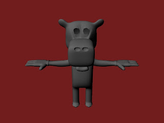
Soooo....1st attempt...meh not bad. Enjoyed the character modelling. Various mistakes but nothing a luittle tweaking won't sort out. let me know your thoughts.
Wednesday, 13 October 2010
GameArt Work
Hey guys and gals, as its the start of a fresh new year i thought i would give you a brief insight into some of the work i did last year, so have a gander and leave me some comments :)
Character experiment
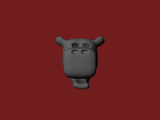
Ok so after several hours of playing with the greek temples ruins, i decided to get out 'Maya 8 at a glance' and have ago at their character modelling tutorial. i recommend the book to all as it has an easy step by step tutorial to each element of maya. Ok so its just a head so far, but the body is soon to come. More soon from your friendly neighbourhood Scottman
Greek Temple 3
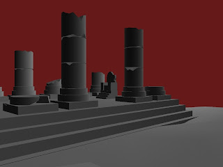
So the first Maya 3D project has fallen upon me....Thank God!! Couldn't wait to get stuck in to the new Maya 2011 software and have a good old fiddle. Compared to Max i couldn't believe how easy the software was to absorb. For my first attempt i did a quick geometric Temple that looked very basic. After submitting this to Steve and getting some feedback it was time to really experiment. After playing around for a good few hours i was able to create a more detailed version of a ruined temple that resembled something out of 'Jason and the Argonaughts'.
Tuesday, 12 October 2010
Monday, 11 October 2010
Confusion...
If Goofy and Pluto are both dogs....why is it that Goofy wears clothes and Pluto doesn't?
Subscribe to:
Posts (Atom)


